Welcome dear Morlocks! We continue with the series dedicated to the creative process of our new iClassics: iLovecraft – “The Colour Out of Space”. After showing you the preliminary script and sketching processes, the process of color and final illustration and the animation of the elements, today we will talk about an aspect with which we take particular care of and we value very much: Layout and Design.
Each iClassics involves taking great care of all the details of the application so that the final result immerses you in the story and facilitates reading. Each author (and in many cases, each story) has a different graphic treatment, both in the choice of the paper background and in the chosen typography, to give it its own personality; at first sight, the design brings you closer to the story that are you going to read.
Unlike the more traditional books, the text (in this form) is a direct part of the immersive experience. Thus, paragraphs can be emphasized to drive focus towards, words distorted to represent an emotion, fonts are changed according to the character and even become part of the illustration. Let’s look at some examples: In the story of Edgar Allan Poe “The Facts in the Case of M. Valdemar” (iPoe vol. 3), his haunting voice, when Valdemar speaks upon death, has a broken, dirty typography, unconsciously forcing one to read the dialogues with a different voice. At the end of this same story, the word “putrescence” is literally decomposing, just like the protagonist of the story.

In H.P.Lovecraft’s story “The Hound” (iLovecraft vol.1), we tried to augment the text so that, without an illustration, we managed to get the anguish and madness that the protagonist suffers at that moment across. Another more subtle example is a page found in our Sherlock Holmes’ iClassics: “A Scandal in Bohemia” (iDoyle), where as we read the text, Holmes’s machinations lead the characters to engage in a street fight and to emphasize the action the words are disordered, as if they themselves are fighting…


If you want to see more examples of iClassics’ typographic design, we recommend that you take a gander at the web of Carlos Ruiz, who designed almost all the titles found in the collection. And with this we wrap up today, a small sample of the work and care behind each iClassics. In the next post, we’ll tell you all about ‘Music and Sound Effects’.
Thanks for reading and Cthulhu Fhtagn!

iLovecraft 2
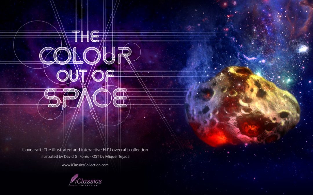
Now you can enjoy “The Colour Out of Space”, one of H.P.Lovecraft’s most chilling stories, in this new interactive format of immersive reading.
Recent Comments